French Amateur Team Undergo Complete Rebrand, But Should They Have Gone Without Roundel Logo?
Update: Unlike originally stated, the design of the Rocquancourt 2023-24 away kit is anything but unique. Instead, it is standard Macron teamwear. It is just the launch pictures that are unique.
Here is FC Rocquancourt, the freshest amateur club in Normandy
We have added more info about the complete rebrand the French amateur team underwent, created in cooperation with French football equipment experts @footpack.
Footpack call them "the freshest amateur club in Normandy".
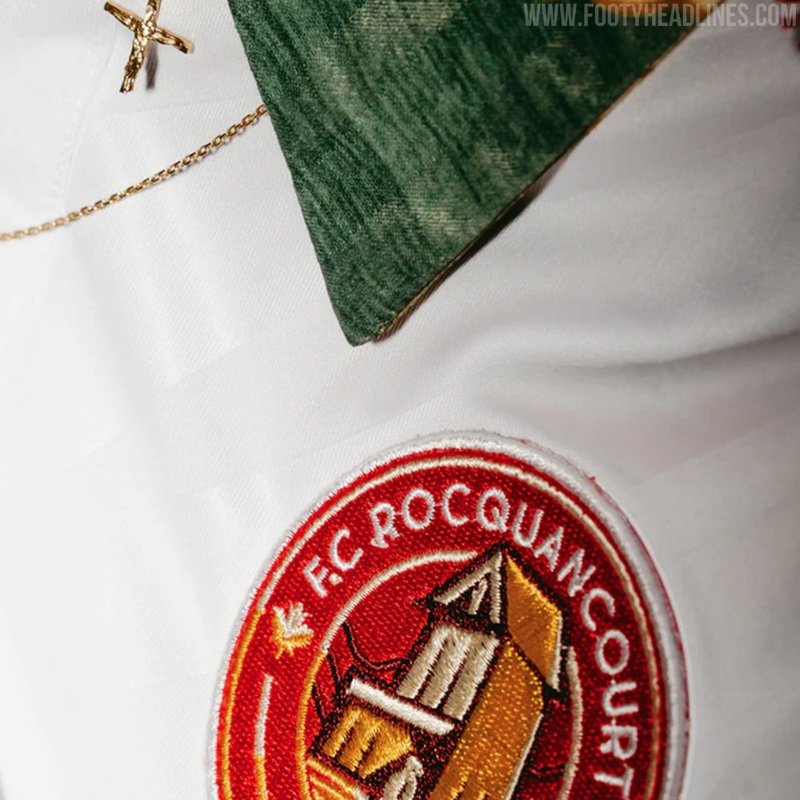
All-New FC Rocquancourt Logo
The new FC Rocquancourt logo is a total change from the amateurism previous crest. It not only returns to the club's red and white colors but also have a more professional look.

However, the logo itself lacks some originality. The roundel design is something that too many clubs have used in the past, and FC Rocquancourt, unfortunately, followed that trend that seems to be over for the big teams.
The logo is still 1000 times better than the amateurish previous crest.
The logo is still 1000 times better than the amateurish previous crest.
FC Rocquancourt 23-24 Away Kit
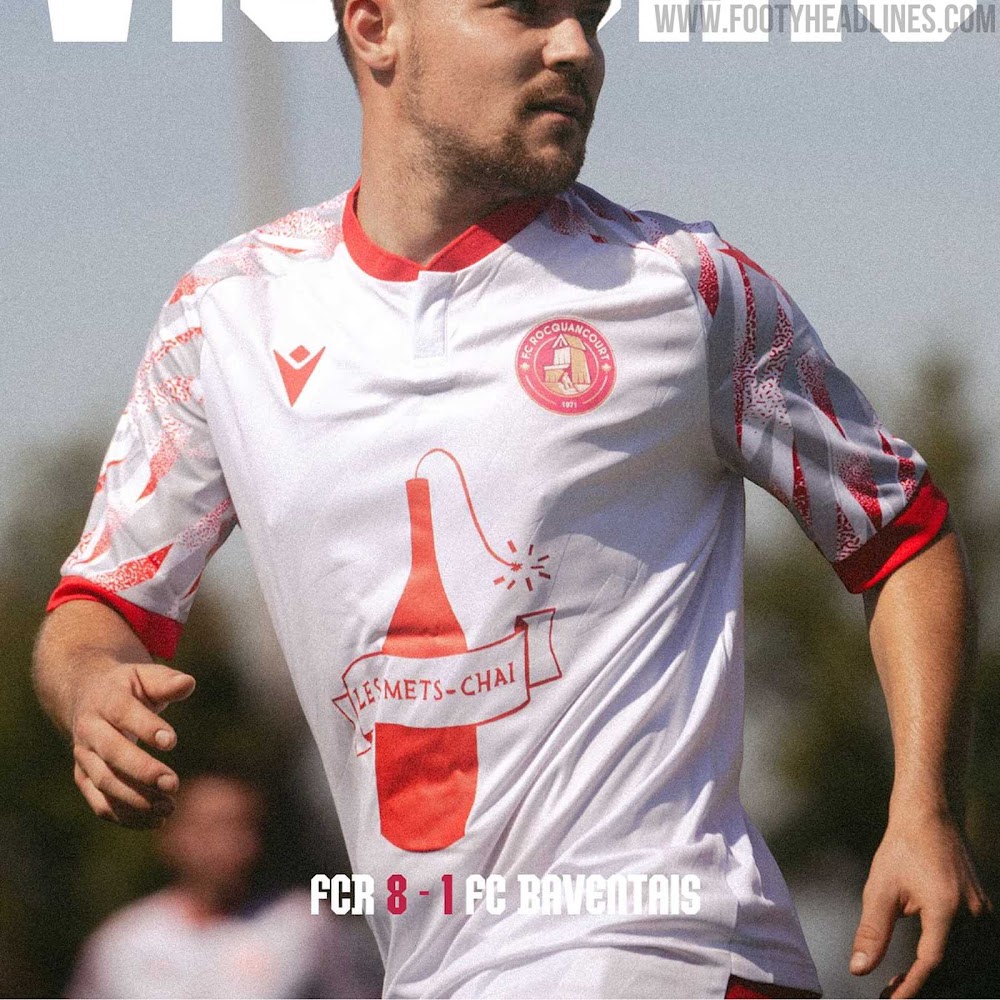
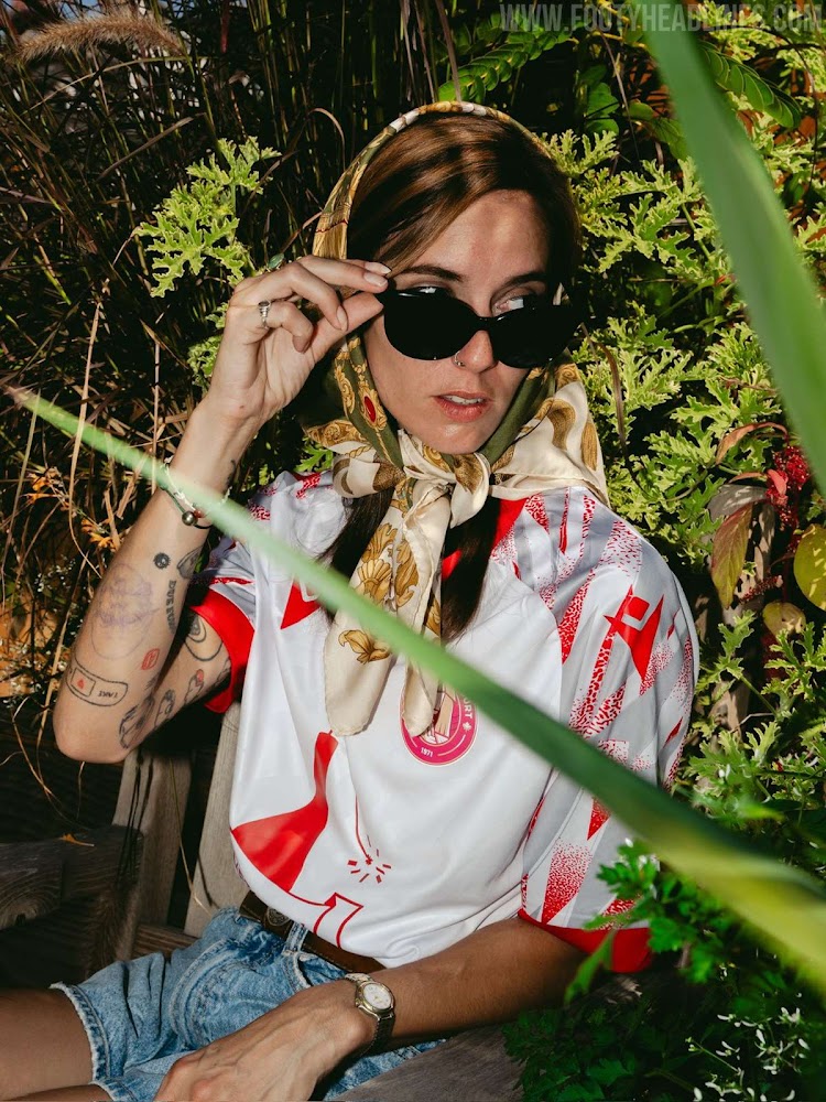
This is the FC Rocquancourt 2023-24 away shirt, made by Macron.
The Macron FC Rocquancourt 2023-24 away football shirt is predominantly white with highlights on the sleeves with unique grey and red motifs. The sleeve cuffs are red.
The design of the kit is not bespoke but 100% teamwear - it is based on the Macron Themis teamwear football shirt. However, the club managed to come up with a brilliant marketing text for it.
"The Renaissance" because it is the rebirth of a senior team in Rocquancourt. A new team, a new family, a new logo, a return to the original colors. It was only natural that we came up with a retro-looking shirt, with 80s patterned sleeves and white highlights. A nod to the Nordic teams of the 90s.
What do you think about the rebrand of FC Rocquancourt? Should they have come up with a different shape for their logo? Comment below.


